
Chugga chugga Chugga chugga CHOOO CHOOOO!!!! Sorry couldn’t help myself LOL. :)
My initial plan for the bedroom was to have a dark gray accent wall with light gray side walls. I really liked the mock up I did and so did our friends and family. We went to Home Depot and purchased a few different samples of Glidden paint. All I can say is paint color looks WAY different on the walls than it does on the sample card or online.
Here is the room mock up I created using Glidden’s website to paint the walls and then I used PhotoShop-ed in add the bedding and my photo from Mexico:

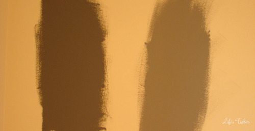
The silver dust color on the side walls turned out to look super purple in the room. The Seal Gray was pretty, but just not what I was looking for. I’m not sure what the lighter gray/silver color is on the wall (in the picture below), because the husband chose it at random and we have since thrown the paint card and sample away. Sorry for the horrible picture. This is what I get for using my old crappy camera.
Feeling discouraged that my gray accent wall wasn’t turning out as I had hoped a friend offered to help us narrow down color choices. We got a gray duvet cover for our wedding and considering it is the ONLY duvet cover we have agreed upon in 2 years we weren’t willing to part with it. Therefore the bedroom color had to compliment gray. Lucky for us gray is pretty neutral! Our friend suggested we do a red wall instead of the gray. I was sold on the idea pretty quickly.
The husband and I had been considering red as our accent color in the living/dining room after finding this Pottery Barn rug. Luckily my husband has purchased a rug sample so it was easy to find a red paint swatch that closely matched the rug, BM Confederate Red (2090-20). During one of my many trips to the paint store I purchased a sample of this paint. It looked nice on the wall, but felt like it had too many pink undertones. I remember my mother had said her friend had recently done a red accent wall in her living room and decided to ask my mom to ask her friend for the paint color. Enter HOT TAMALE! It’s a C2 paint, which is suppose to be thick enough to only have to do one coat of paint.
Anyways we slapped C052, aka hot tamale, paint sample up on the wall and we had a winner! Since the red rug didn’t match the red paint we decided to say goodbye to rug. We are now thinking a gray rug with red accents around the room to tie everything together. Hopefully it turns out well!
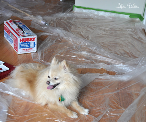
With the walls taped and the floors covered I was ready to begin painting. Sophi supervised the whole thing. :)
I’m proud to say I pretty much painted this whole wall myself. One thing I quickly learned while painting the red wall was to do the trim first. Painting the trim first with a brush and then going over it (or close to it) with the roller made it blend better. When I rolled and then did the trip the brush strokes stood out more.
Although C2 paint is supposed to only need one coat we decided to do two. As it was my first time really painting as well as wanting it to look perfect the second coat made a world of difference. I was very methodical about the second coat too and started at the left and worked my way right instead of starting in the middle as I did with the first coat.
When I removed the tape I noticed the window frame had some red on it … oops. I also noticed the tape pulled up a few small pieces of the paint around the edges.
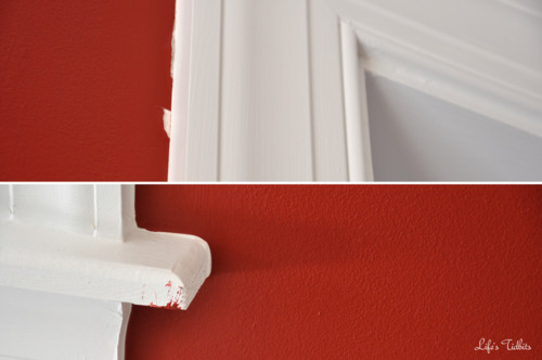
Luckily my husband has a steady hand and went ahead and touched up the places where the paint lifted from the wall. Now all I need to do is touch up the window frame. Two mistakes, not too bad if I do say so myself.
Here’s the before and after of our red hot tamale wall:

I can’t wait to paint the other three walls a creamy white and then we can call the master bedroom a wrap on the painting front. I’m on the hunt for some nice little red accents to put in the room.
What do you think of our red wall?
Happy painting!

Don’t forget to leave your tidbit by commenting below :)
